PTE Speaking - Describe Image Templates & Tips
Tips
- Begin with a brief introduction, mentioning key elements.
- Use appropriate vocabulary and descriptive language.
- Summarize the image and make conclusions.
Scoring Format
- Content: 0/90
- Oral Fluency: 0/60
- Pronunciation: 0/5
Usable Describe Image Templates
Certainly! Here are example templates for describing images of various types, including line graphs, bar graphs, pictures, tables, pie charts, and maps:
Line Graph

- The image before me appears captivating and intriguing. Let me examine it more closely, and upon closer inspection, I can see it is a
[ line graph ] - It illustrates the
[Monthly Rainfall]. - The heading provided on top of the image is
'Title | Monthly Rainfall in Major cities.' - X-Axis represents
[months from January To December]. - Y-Axis represents
[Rainfall in Milimeter] [Yellow]color represents[Rainfall]in[Berlin City][Blue]color represents[Rainfall]in[London City]- Overall, it can be concluded that this image has crucial information about the topic, strongly supported by important facts and figures
- And, has a great impact on our understanding of
[topic | Monthly Rainfall in Major cities].
Bar Graph
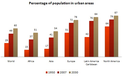
- The image before me appears captivating and intriguing. Let me examine it more closely, and upon closer inspection, I can see it is a
[ bar graph ] - It illustrates the
[percentage of population]. - The heading provided on top of the image is
'Percentage of population in urban areas'. - The X-axis represents
[landmass], while the Y-axis represents[population in percentage]. - The
[orange]color represents[year 1950]. - The
[dark red]color represents[year 2007]. - The
[brown]color represents[year 2030]. - Overall, it can be concluded that this image has crucial information about the topic, strongly supported by important facts and figures
- And, has a great impact on our understanding of
[topic | population in urban areas].
Picture
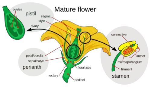
- The image before me appears captivating and intriguing. Let me examine it more closely, and upon closer inspection, I can see it is a
[ picture of flower ] - It illustrates the
[different parts of a flower]. - The heading provided on top of the image is
'Mature Flower' - Prominent parts, such as
pistil,stamen, andperianth, are visible in the photograph. - The
[yellow]color represents[petal]. - The
[green]color represents[stamen]. [DESCRIBE MORE IF YOU CAN]- Overall, it can be concluded that this image has crucial information about the topic, strongly supported by important facts and figures
- And, has a great impact on our understanding of
[topic | different parts of a flower].
Table

- The image before me appears captivating and intriguing. Let me examine it more closely, and upon closer inspection, I can see it is a
[ table ] - It illustrates the
[mode of transport]. - The heading provided on top of the image is
modes of transport used in three countries - The columns represents
countries - The rows represents
mode of transport [DESCRIBE MORE IF YOU CAN]- Overall, it can be concluded that this image has crucial information about the topic, strongly supported by important facts and figures
- And, has a great impact on our understanding of
[topic | modes of transport used in three countries].
Pie Chart
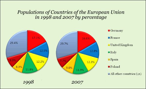
- The image before me appears captivating and intriguing. Let me examine it more closely, and upon closer inspection, I can see it is a
[ pie chart ] - It illustrates the
[population distrubution of EU]. - The heading provided on top of the image is
Population of countries of the European union in 1990 and 2007 by percentage - The
[different]colors represent different entities like[germany, france, UK, Italy, Spain, Poland and other]. - Pie 1 represents
the year 1998and Pie 2 representsthe year 2007 [DESCRIBE MORE IF YOU CAN]- Overall, it can be concluded that this image has crucial information about the topic, strongly supported by important facts and figures
- And, has a great impact on our understanding of
[topic | Population of countries of the European union].
Map
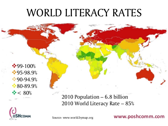
- The image before me appears captivating and intriguing. Let me examine it more closely, and upon closer inspection, I can see it is a
[ map ] - It illustrates the
[literacy rates]. - The heading provided on top of the image is
World Literacy Rates - The
[different]colors represent different entities like[99-100%, 95-98.9%, etc]. - the map marks the whole world
- In
2010the population of world was 6.8 billion - In 2010 the world literacy rate was 85%
[DESCRIBE MORE IF YOU CAN]- Overall, it can be concluded that this image has crucial information about the topic, strongly supported by important facts and figures
- And, has a great impact on our understanding of
[World Literacy Rates].
These templates can be adapted and customized to suit the specific content of the images you encounter in the PTE Academic “Describe Image” task, helping you provide clear and structured responses.
